Oorvi
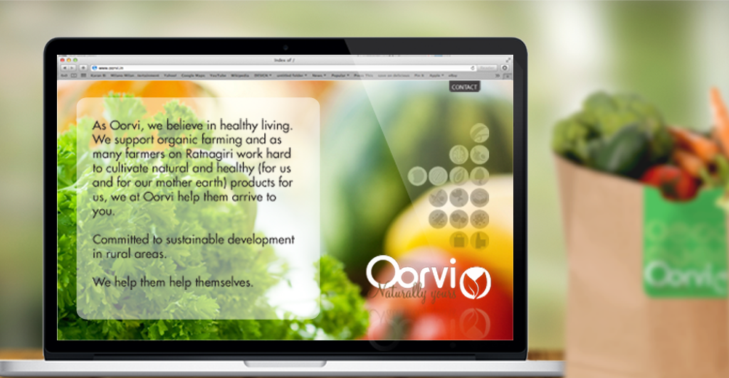
Oorvi supports bio farmers, especially from the region of Ratnagiri, to get their produce to the consumer with higher profit to reinvest in further bio harvest.
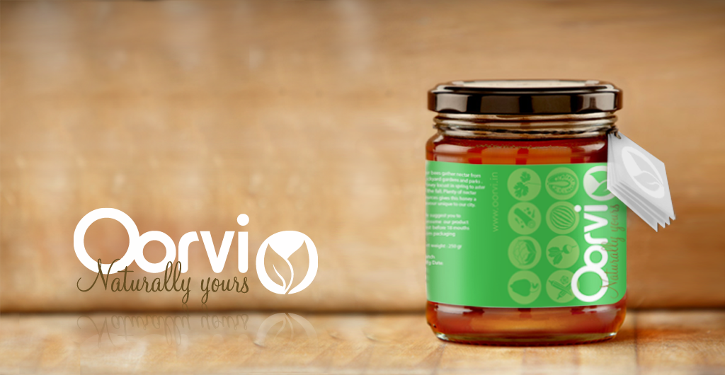
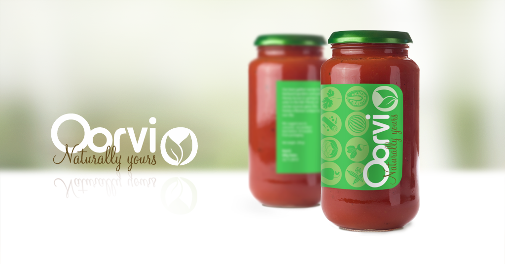
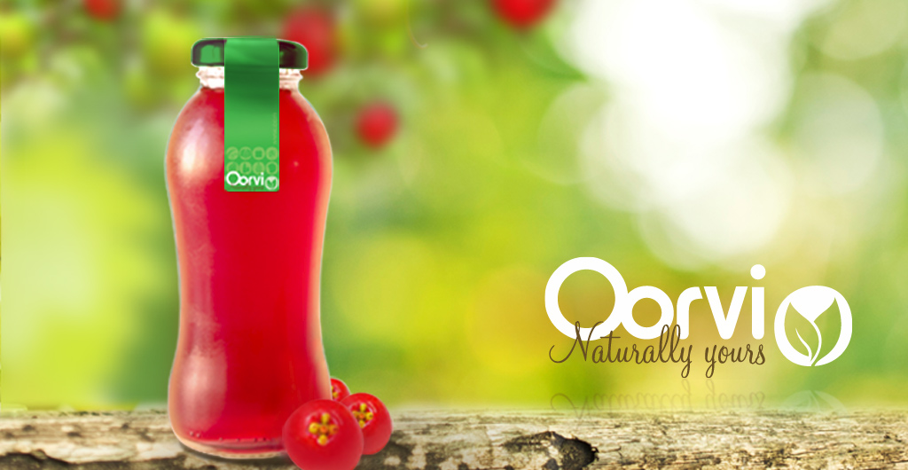
The tone of the entire identity is minimalistic, without any frills and focused. The word Oorvi means Earth is Sanskit. Inspired by earth; simple, round and green icons represent every category of the products. The icons are used as buttons on the site and create a pattern on the packaging thats designed for minimum waste. Just simple stickers in different sizes that can be applied directly on big fruits, newspaper bags or glass jars. After all, bio farming is also about causing minimum harm to the mother nature!
Discipline: Brand Strategy, Identity, Logo, Icons, Packaging, Posters, Communication & Marketing Material, Website
Sector: BioFarming, Agriculture, Food
Regione: India
