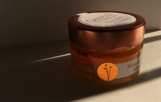
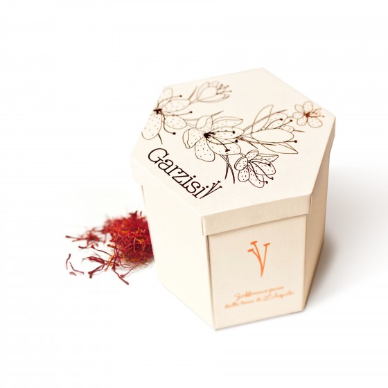
Blog Archives

Saffron is a precious spice for its values and the elaborative production process. With the aim to preserve the purity, we designed the pack in a way that no direct contact is needed with these valuable delicate stems till their final destination: a delicious recipe! A glass jar that contains and preserves the saffron stems is sandwiched between a wooden mortar and pestle, made with beechwood. The cap with a added sphere […]

PV Sons
PV Sons is a family-run company from India, dedicated to producing the highest quality raw material for the food products around the world. They have been catering to various top multinational food giants for more than 25 years. After studying the brand and products we upgraded their previous logo. The symbol now has a streak of sun rays shining above the golden corn. Where as the logotype is now more sophisticated and compact. […]

Wisil Latoor SRL Identity
Wisil Latoor SrL is one of the largest dental laboratories in Italy. Founded in 1955, the lab is synonymous with tradition compiled with innovation. After studying the market and their equity, we revived the brand identity with fresh colours and clear images. Logo, stationary, website, print and online communication, trade fair and social media, all got pumped with the new energy. Find out more on www.wisillatoor.it Discipline: Brand Strategy, Brand Identity, Logo, Brochure, Website, Advertising, Tradefair, Illustration, […]

Emotiqon
An innovative consultancy, Emotiqon focuses on developing emotional intelligence in people of all age groups. Even though gaining momentum, the topic of Emotional Intelligence is not as popular in Indian society. Emotiqon required a brand design that invites children and adults alike to explore this world of EQ further. The important mediums were Website, Training Materials and Games dedicated to EQ training. The 32 adorable facial expressions represent most frequently […]